Kid's App
iHeartRadio Family | 2015
This app was born in a hackathon where I came up with the concept and worked with a developer to produce the proof of concept.
iHeartRadio believed in the project so much that they invested on it to go live.
Prior to its launch, it already won its first million dollar sponsorship with Build-a-Bear Workshop.
ROLE: UI UX Design & Direction
The PITCH
Hackathon
Industry Analysis
I evaluated the industry to see how they are providing content to kids. It turned out that companies like Netflix, Discovery Channel, YouTube have created standalone apps for kids for a safe and simple environment for them to discover content appropriate for that age range of 4-9yrs old.
Analytics Request
I took a look at our iHeartRadio listeners to make sure that iHeartRadio kid contents are being consumed by parents and kids alike. And sure enough, our TLH for a number of our kid's contents are high enough to create a case.
Proof of Concept / Hackathon(24hr)
I worked with a developer to create a prototype in html to present to the stakeholders our findings. We presented that this brand new iHeartRadio app will be a standalone simple experience with engaging imagery and animation will introduce the company into a new shelf space, kids and entertainment.
PROCESS
After winning the attention of the CEO, Sales, Marketing and Product Officers, they funded the project and we went straight into additional UXUI competitive analysis, designing, prototyping and developing under the agile methodology.
Business Goals
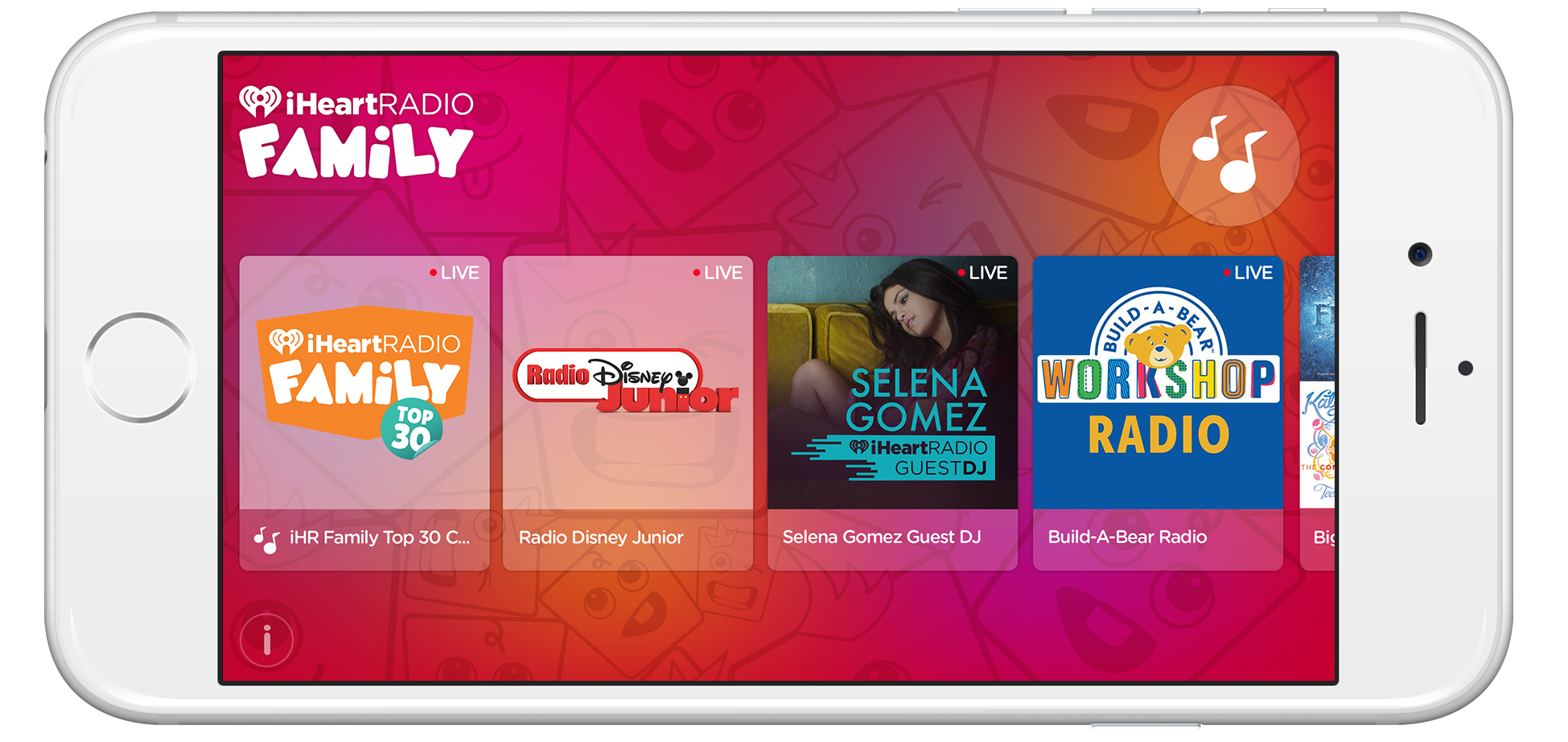
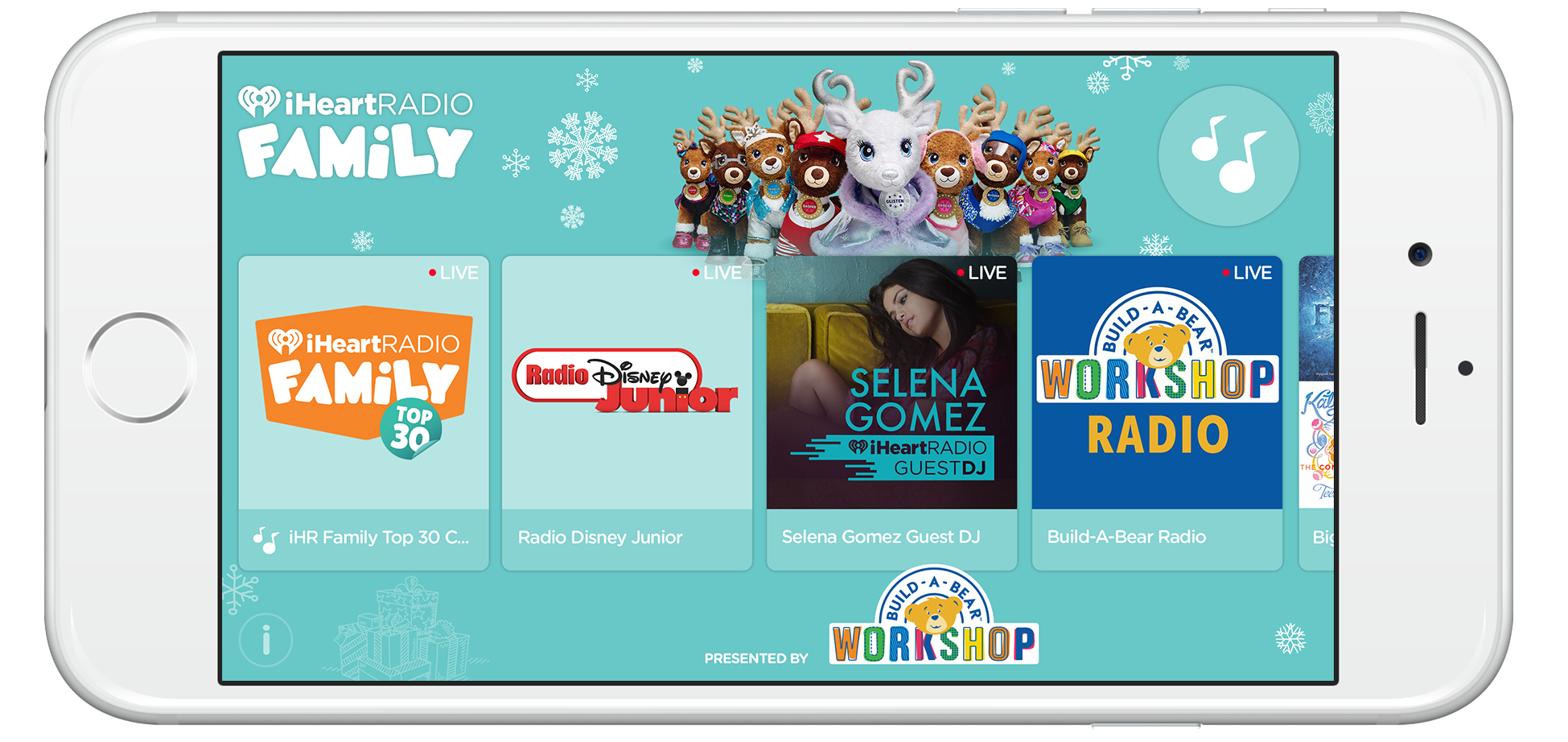
- iHeartRadio has a large kids audience as well as parents who let their children enjoy kid friendly music. iHeartRadio Family app was the answer to this challenge.
- Design a simple experience showcasing stations and media player for children ages 4-9yrs with engaging animations.
- Create affordance for sponsorship.
- iHeartRadio Family was an entry to a new shelf space – kids.
prototype by sean vickery
interactive direction by mary ann s lewis
Prototype
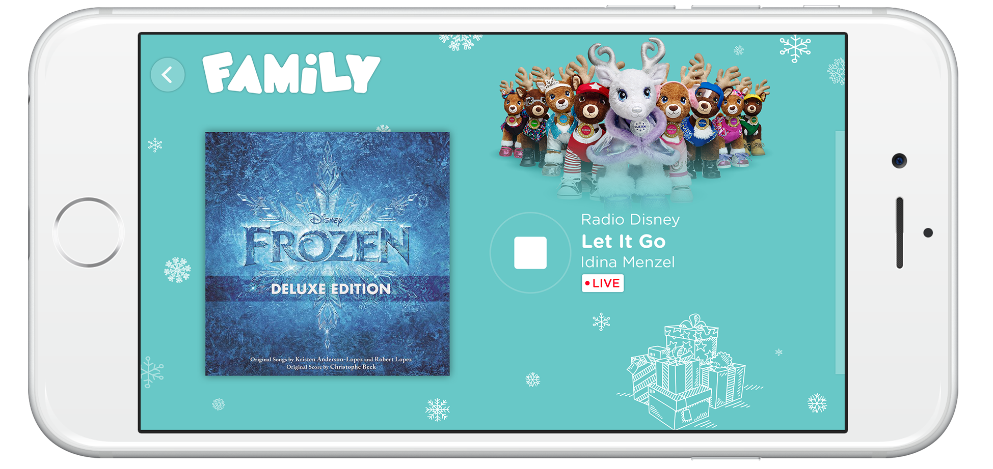
I lead the interactive direction alongside a video animator to prototype multiple concepts of the app. It was important that the animation was taken into heavy consideration so that navigating from the browse experience into the player is not just a task but also visually exciting and delightful for kids to enjoy.
Goal
Show and work with engineers how the app will work and animate. This would serve as a blue print for engineers to build.
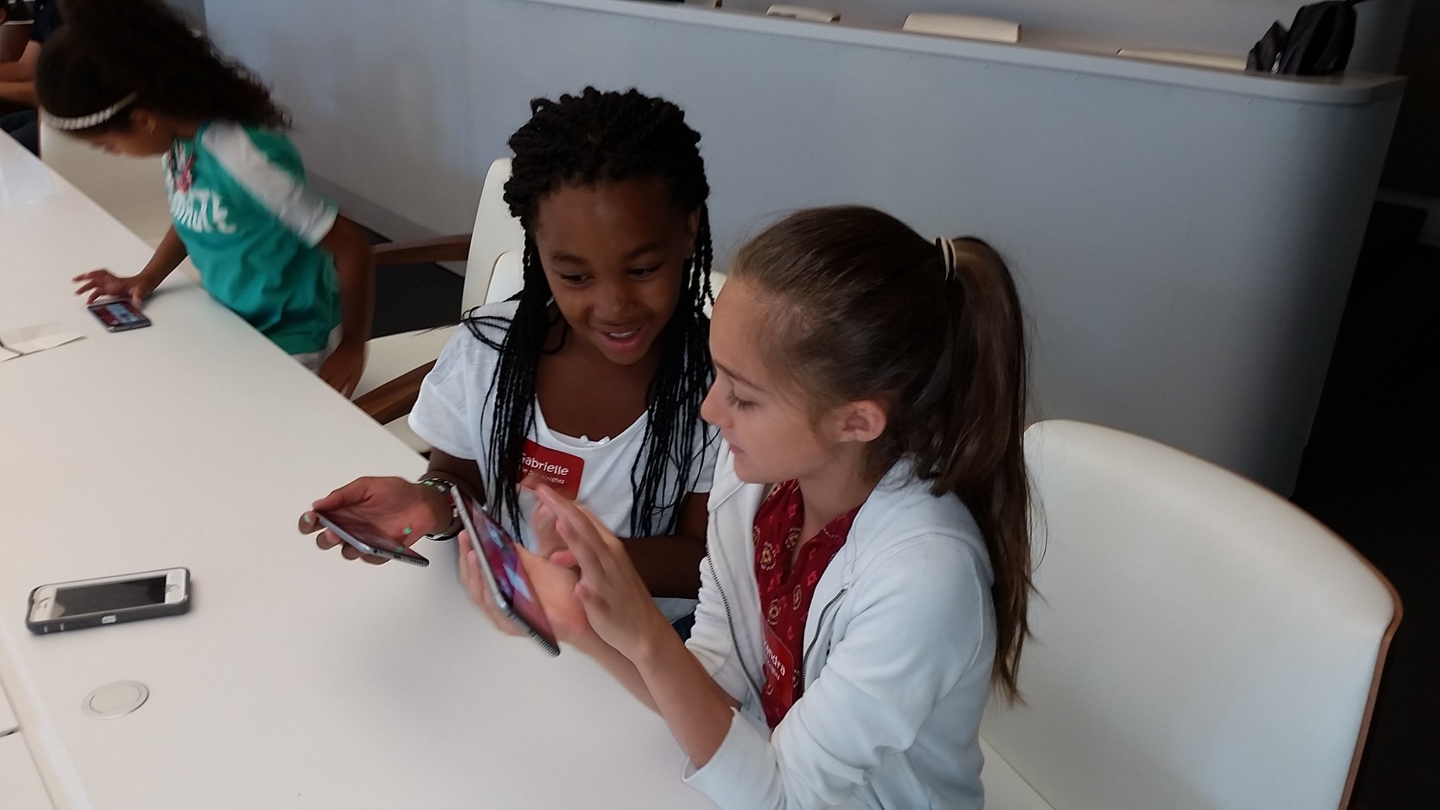
User Testing
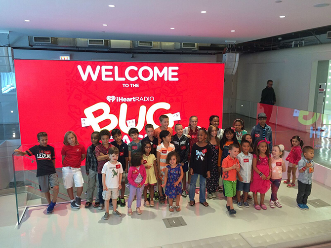
Once our first build was ready, we tested it to kids ages 4-9yr olds.
Here are some of the things we tested:
- Will they be able to tell the difference between a curated and live station? Did this matter to them?
- Did the kids understand what the music note animation meant(miniplayer)?
- Were they able to find the back button on the player?
- Were they able to intuitively swipe to skip a song?
- Did they understand how many skips they were only allowed to have?
Findings
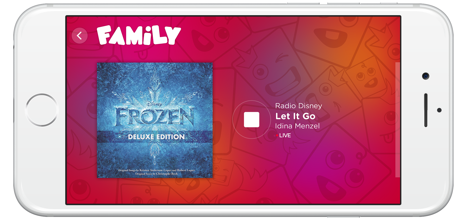
Live vs. Curated Station: Older kids needed more visual information about the difference between the two. However, younger kids were not affected by these two options. Later, we added 'Live' indicators on the top left of each station tiles on browse experience.
Miniplayer: All kids intuitively selected the miniplayer and expected that they were going to be taken to the player screen.
Back Button: All kids found the back button and expected that they were to be taken to the browse experience. However, older kids found it hard to interact with the button because the touch area was too small. Later, we increased the touch area, so that the logo and the back button became the touch area.
Skip Songs: Kids intuitively swiped to the left to skip songs. Some kids got frustrated that they only had a limited amount of skips. One had mentioned that, it would be best if he knew how many skips he had left, so he would be more careful to use the skips he had.
Creative Direction
Visually loud. Fun personality. Meaningful and engaging animation.
Sponsorship
The company wanted to take full advantage of the real estate to increase partnership impact–presenting partners as part of the immersive experience in tandem with iHeartRadio Family. Skinning the browse experience as well as selected station was the most effective solution to this business requirement.
Web
Users needed to have a point of place to discover and download the app. We designed and developed a responsive website for users to access iHeartRadio Family and its benefits. The background scene changes with seasons.
Branding
From mood boards, to sketches, color theory and keeping typography and iconography close to flagship iHeartRadio brand, below illustrates brand identity.


Of course, 2015 was an awesome year, iHeartRadio Family made it to the Amazon Appstore Best Apps of 2015.
Thanks for sticking around! Whew! :)