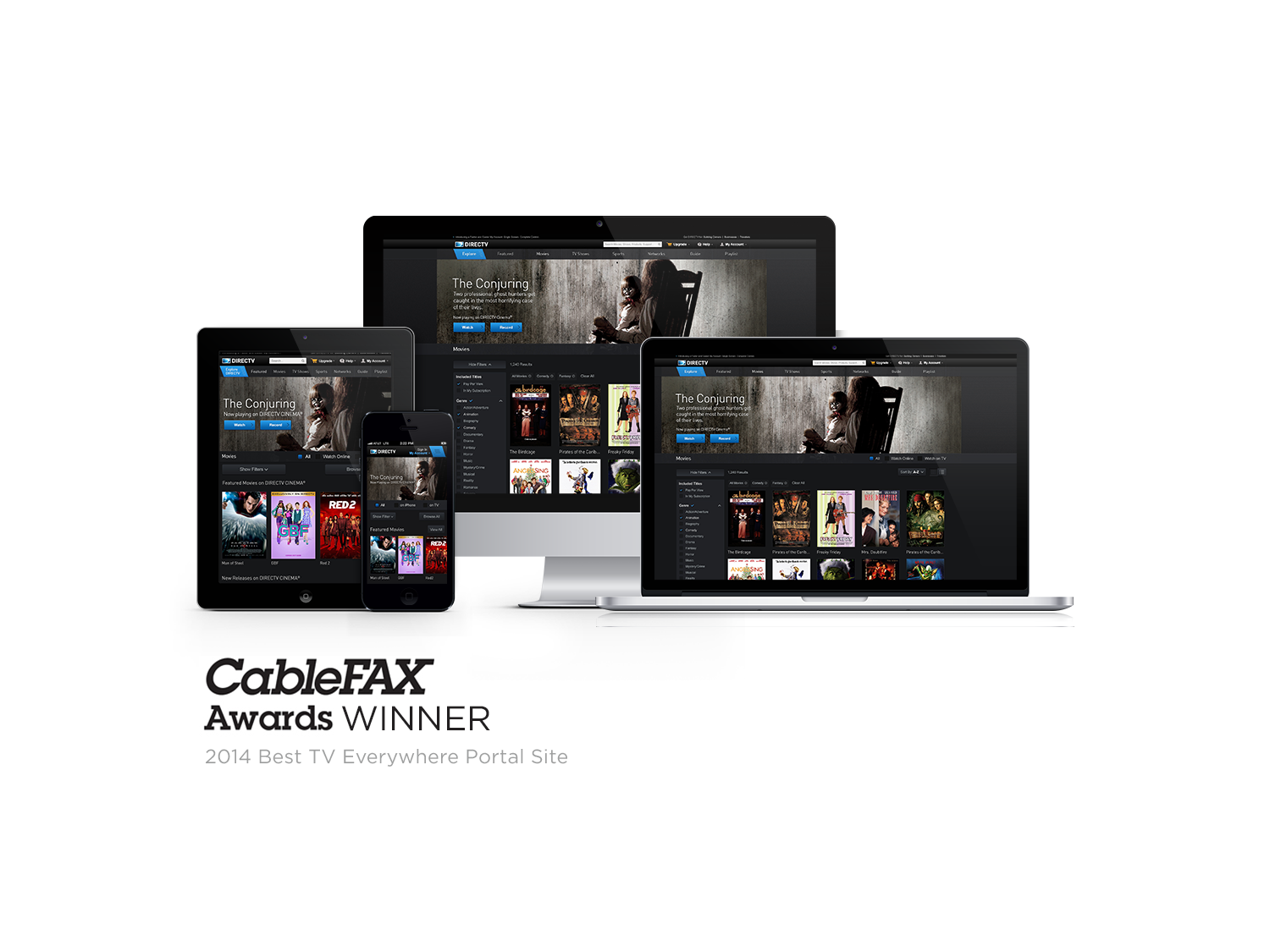
Entertainment Portal
DIRECTV Entertainment Portal | 2014
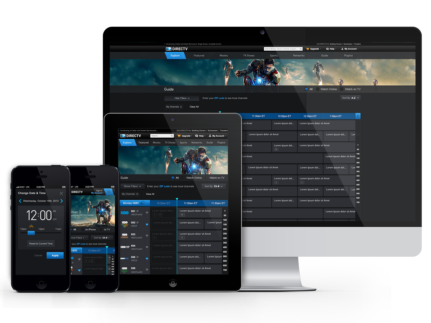
DIRECTV Entertainment portal delivers on-demand television, movies and sports events. Users are able to buy pay-per-view, record content on their set-top boxes and stream right on the website. This is a redesign of the original entertainment site.
BUSINESS GOALS
The vision behind this redesign was to create the entire entertainment section responsive, introduce a more modern look, simplify the experience to best facilitate for easy streams, pay per viewership and recording content, and to add an interactive flare.
PROCESS
This project was done under the agile methodology, 2 UI and 2 UX designers. This was the first project that DIRECTV Digital Media Group undertook under the Agile methodology.
ROLE
UI Designer

Challenges
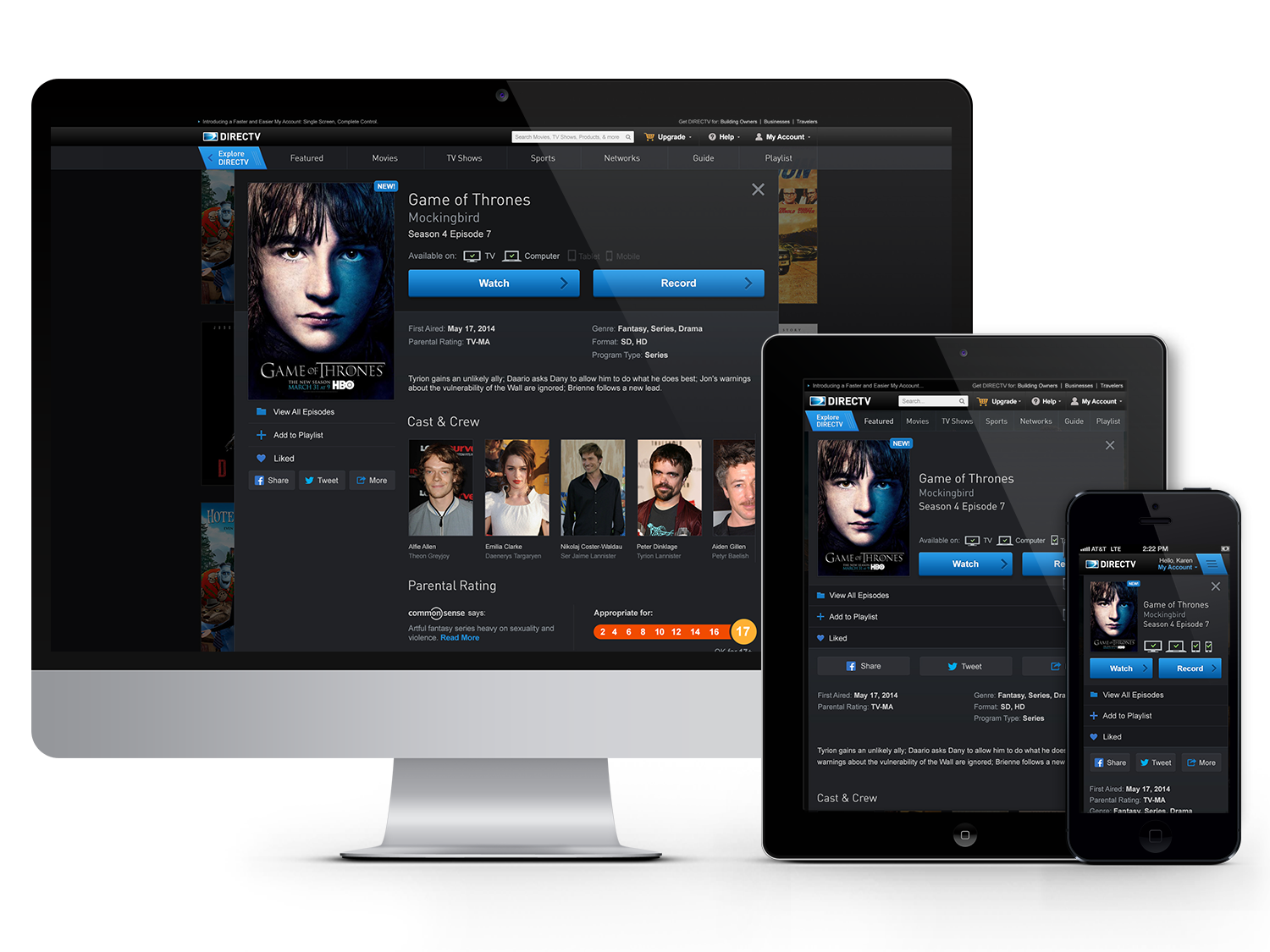
Breadcrumb
Breadcrumb allowed users to navigate back and forth into detail pages and discovery pages.
- Pain Points - Based off analytics data and user testing, users were not using the breadcrumb links to navigate back to previous pages. This is a pain point for users wanting to decide what movie, tv title they wanted to watch/record. Users would take longer time to go to the detail pages and back to browsing for titles.
Order/Record/Ways to Watch CTA
Users used used CTAs like Order, Record and Ways to Watch on detail pages.
- Pain Points - Based off analytics data and user testing, users only accessed Order CTA and Ways to Watch within the details page on DIRECTV's web entertainment portal. Users had a difficult time finding other ways to consume the title they're interested in.
Content Availability
Content Availability are UI indicators of where users will consume the title to watch.
- Pain Point - Users had a difficult time figuring out which device this particular title was available in since the indicators were hidden in Ways to Watch tab.
Solutions
After an extensive research, competitive analysis and user testing, here are some of our solutions:
Layering > Breadcrumb
- When users select a title from the browse experience, content detail pages would open up on top of the browse experience. Instead of users clicking the back button on the browser, we created a navigation system within the portal to ease accessibility to the details page.
- Users did not feel like they left the browse experience and was taken to a 'quick preview'.
- Close icon accessibility made it easier for users to dismiss content pages and get back to browsing.
Simplified Relevant CTA
- Simplified 2 paths and brought both actions in one area for users, to watch or to record.
Surface Content Availability
- Surfacing device availability above the 2 relevant CTAs helps users decide to make a commitment on where they should consume their content.
Success
- The redesigned experience earned:
- 15% increase on pay per view
- 60% increase in streams
- 90% increase in records.
- The site also won its Cable Fax Award for Best TV Everywhere Portal Site